Kollective IQ, our advanced analytics platform, has new dashboards that will reveal some key performance indicators (KPIs) commonly used to assess event performance. The dashboards have been redesigned to help better understand the impact and quality of your events, engagement across the enterprise, and so much more!
Kollective IQ contains three primary dashboards:
- Views & Experience
- Delivery & Consumption
- Network Performance
Views & Experience Dashboard
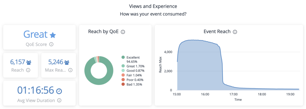
The views and experience dashboard displays the reach, stream quality, and engagement of an event. Top-level insights are easily digested through the six key performance indicators (KPIs) displayed in the dashboard. Users can drill down to explore data on specific users by interacting with the graphs. If you hover over a tile, there are options in the upper right corner that will allow you to download or explore the data, and even set an alert for metrics that could be of particular interest.

Quality of Experience (QoE) Score is an aggregate rating, representing the overall stream quality for everyone that viewed an event. This score is a combination of two factors -- the quality of video received (measured by bitrate) and the time to first frame.
Reach indicates how many unique viewers streamed an event.
Max Reach represents the greatest number of simultaneous viewers during an event.
Average View Duration measures the average amount of time viewers spent watching the event.
Reach by QoE is a pie-chart organizing viewers by the level of stream quality they experienced during an event. Scores are displayed on a graded scale, ranging from excellent to bad. Click on the pie-chart to explore specific segments in greater depth.
Event Reach Over Time reports the reach for every minute of the event. This indicates audience engagement, allowing one to easily identify changes in attendance over the course of an event. Monitor this graph while your event is running for engagement insights.
With the views and experience dashboard, your team will understand:
- How many people attended an event
- When attendees joined and left an event
- How engaged employees were during an event
- Any issues with buffering and stream quality
Delivery & Consumption Dashboard
With hybrid work becoming the new norm, it’s crucial that businesses understand where and how their content is streamed to ensure video communications are successfully delivered throughout the enterprise. This delivery and consumption dashboard does just that. The intuitive graphs and interactable map enable the rapid identification of locations that experienced buffering problems during an event.
Delivery Map shows everywhere your event was viewed. Larger circles indicate areas with greater viewership. Users can explore and interact with the map directly. Click on clusters to view detailed data for specific offices or locations.
Views by Location are a series of four separate bar graphs that are broken down into geographic segments (external IP, locality, country, and city). Each graph lists the top ten places with the most event views. These charts include QoE dots that represent stream quality for each location. See a region with poor stream quality? Click on the corresponding bar graph to explore the data in more detail, uncover potential trends, and develop a resolution plan.
Views by OS details which operating systems were used to stream an event.
Views by Browser displays which browsers were used to stream an event.
With the delivery and consumption dashboard, your team will understand:
- Where an event was streamed
- Which offices participated most in an event
- Where issues with stream quality and buffering occurred
- What browsers and operating systems were used
Network Performance Dashboard
The network performance dashboard shows how much bandwidth was saved by using Kollective’s enterprise content delivery network (ECDN) to deliver the event. Kollective IQ’s dashboard offers a unique lens into network performance, allowing users to monitor an event’s impact on their network in real-time as an event runs and after it ends.
Total Savings is the total bandwidth savings for all viewers of an event, including those not capable of peering.
Capable Savings is the total bandwidth savings for all viewers of an event that were capable of peering.
Peerable Savings is the total bandwidth savings for all viewers that successfully peered an event (joined a cluster with other peers).
Peering Efficiency displays the percentage of bandwidth that was delivered through peering in relation to the size of each peering group.
Bandwidth Over Time shows the amount of bandwidth that’s consumed over the course of the event. This graph is an excellent indicator of the ECDN’s performance. The green portion of the graph represents the amount of bandwidth that was pulled from your network, while the blue portion displays the amount saved from peering.
With the network performance dashboard, your team will understand:
- How much bandwidth Kollective's ECDN saved your network
- Bandwidth utilization over the course of an event
- How well your event was peered
Kollective IQ – A Perfect Addition to Your Communication Platform
Adding an advanced analytics platform like Kollective IQ supercharges your broadcast event reporting, yielding actionable insights to help you understand employee experiences and maximize performance.
