As you may imagine, childhood for someone who grew up to find a career in building data and analytics platforms was filled with… well… chess club. Obviously. Time at the library? Sure. Legos, a wide array of board games, and last but not least, learning card tricks from my older brother. With every new trick that he would show me, I would feel a sense of awe and that something magical was afoot. And as soon as the trick was finished, I would always have the same question… “How did you do that?”.
Analytics, when done right, often feels like magic. It reveals insights that we didn’t know were possible, and it wows us. It knits together data and metrics uncovering something that felt hidden and unknowable before. And it usually leaves us with that same burning question of ‘how did this seemingly magical insight come about?’
Here on the Kollective IQ (Kollective’s enterprise-ready analytics and intelligence platform) Team, we have had our noses to the grindstone building out an analytics suite that we hope delights, informs, and delivers the insights you need, where you need them. We did this by no slight-of-hand, but by spending a lot of time with our customers – listening to their business problems, understanding their KPI’s and critical metrics, and gaining an understanding of the data that would make their lives at work easier.
With that in mind, we are excited to announce the addition of two new features currently in development in Kollective IQ that add some “magic” to the platform.
The GeoExplorer
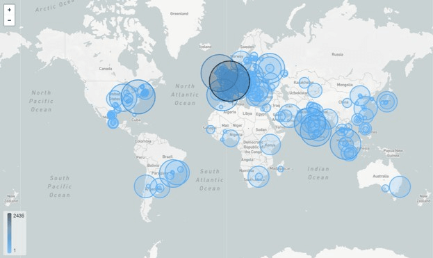
As our clients continue the digital transformations of their businesses, we hear over and over the common refrain from network administrators and communications leads alike, “We are a global company, and it would change my life at work if I could see how our messaging is consumed across the globe, and how successful it was in reaching all of our offices. ESPECIALLY the ones that we know are short on bandwidth and high on the need to connect to the rest of the organization.” We wanted to solve this. And that’s where the GeoExplorer comes in. The GeoExplorer will give you insights into how your content AND your network performed across all of your locations globally. In an incredibly visually-striking, engaging and interactive manner. Whether you want to see how much content was consumed, how many users consumed the content, or even if there was a lag or buffering event in the delivery, the GeoExplorer effortlessly surfaces the insights to you.
The Network Explorer (Peering Graph)
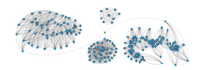
We know that network intelligence is hard to come by. Getting network intelligence in a form that is not incredibly cumbersome and in the form of a complex data table is even harder to find. For the last year, we have been thinking and prototyping a way of delivering network intelligence and insights that does the heavy lifting for you. Enter the Network Explorer. By presenting your network in a “force graph”, and allowing you to filter the graph by the metric that you need to quickly know about (buffering, peering, locality, External IP’s), you can gain insights in seconds that would normally have taken hours and sometimes days to assemble. While it took the data team here many prototypes and months of work to model and structure the data in a way that will satisfy the market and delight our customers, upon release it will transform the way you can view your network, it’s performance, and the content that is being delivered across it. It was worth the wait, and the countless hours poring over the data and data science backing this dare I say, “magical” tool.
If you’d like to see a demo of these new features, and all of the other terrific actionable tools in Kollective IQ, request a demo today.